We can use SAP Focused Run OCC Dashboards to build a ABAP Dump Trend Analysis dashboard.
Using OCC Dashboard we can use the data provider for System Monitoring to pull the data of Short Dumps per day metric in to a trend chart.
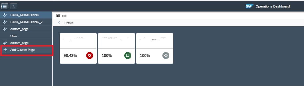
For accessing the OCC Dashboards app click on the OCC Dashboards App in the Advanced Analytics & Intelligence section of the Focused Run launchpad.
In the OCC Dashboard app you can create a new dashboard page by clicking on Add Custom Page in the navigation panel.
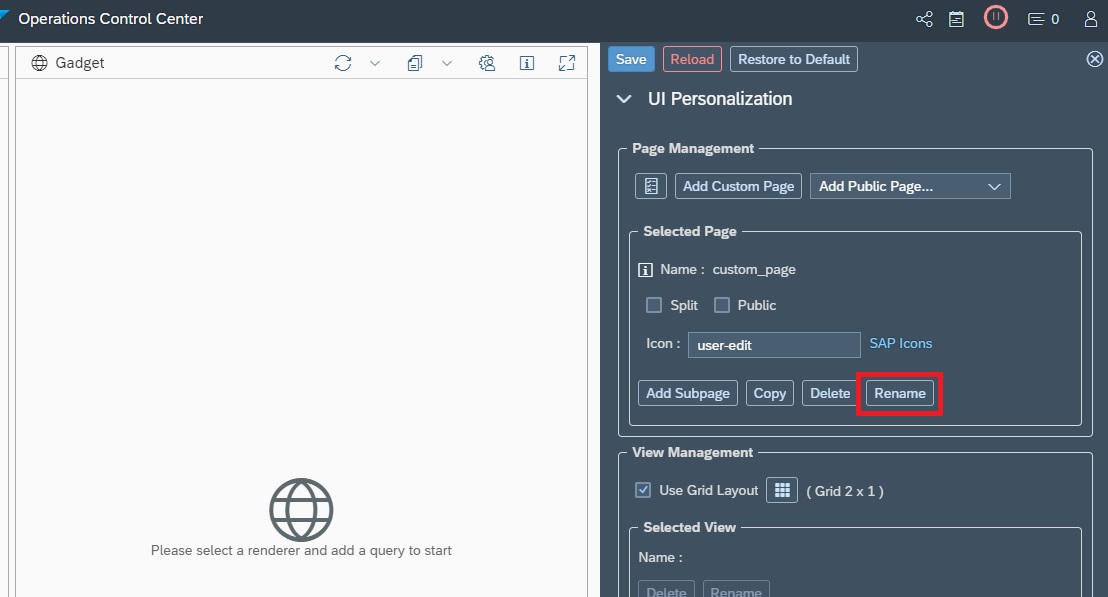
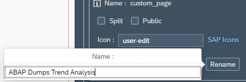
By default your new page will be named as custom_page, you can rename your page by clicking on Rename in the settings section and then providing a new name.
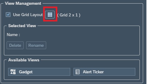
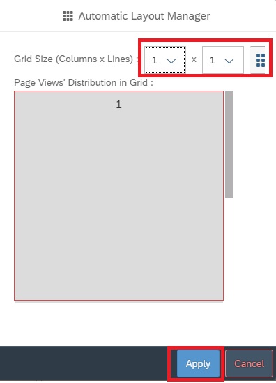
In the View Management section of the settings area you can modify the grid layout. By default you have 2 columns in 1 row. In this example we will change to 1 X 1 to keep just the ABAP Dump Trend Analysis dashboard. (Note: we can add a dashboard to each grid in the layout).
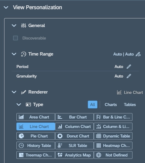
Now for adding the dashboard to the pane we just created, we click on the settings button for that pane.

Then in settings area, under View Personalization –> Render we select the graph type. In this case we want to perform a trend chart so we select Line Chart.
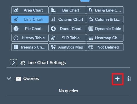
Now we need to create a query for the chart that would provide the data for our graph. For this in the Query section we click on the + sign to add a query.
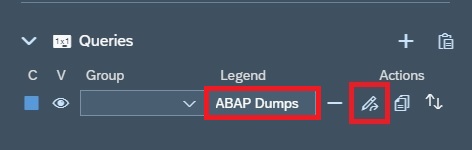
Now in the Query Section, for the newly added row you provide a name under Legend and then click on the change button to start editing the query.
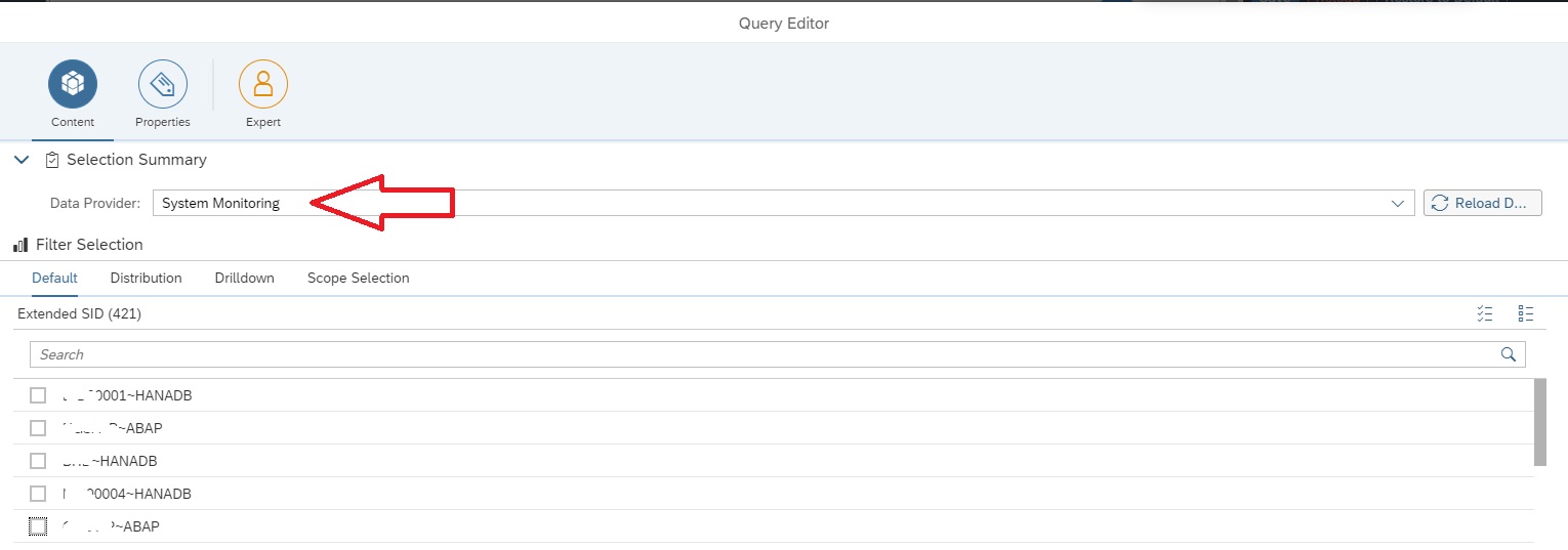
In the Query Editor screen select the data provider System Monitoring.
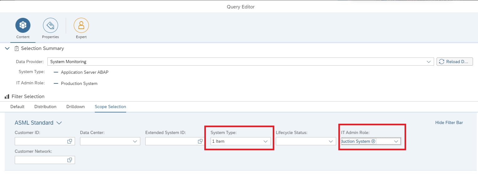
Now we navigate to the Scope Selection tab to select the managed systems for which the dashboard should display data. In this example we selected System Type as Application Server ABAP and IT Admin role as Production to select all ABAP production systems.
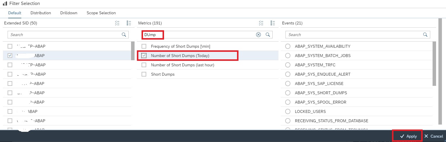
Now in the Default tab , under Extended SID select any ABAP system and then under Metrics tab select the metric Number of Short Dumps (Today). Click on Apply button to activate the selection.
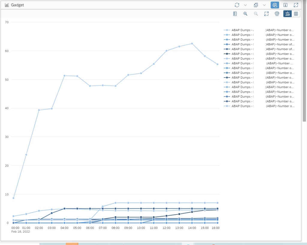
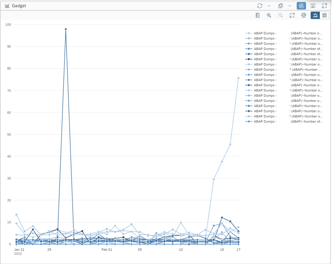
Now you can see the ABAP Dumps trend lines for the selected scope of managed systems in the graph.
Note: By default a graph for System Monitoring data provider will select Auto resolution of data which will show the data for today with hourly frequency.
You can change the resolution in the Time Range Section in the Settings area. For example here we set Period for last 30 days as “l30d” and Granularity for every day or daily as “d”.
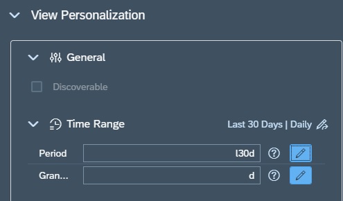
Note: OCC Dashboard graphs will always average out the data as per the granularity set for the graph w.r.t actual collection frequency of the selected metric. For instance if the metric Number of Short dumps (Today) has a hourly frequency and we show the daily data in the graph, then the value shown in the graph will be average of all hourly data collected by the metric for that day, which will of course be different from the actual final daily count. Hence to ensure data shown on graph is accurate, ensure that the Number of Short Dumps (Today) metric has a daily frequency. Then the granularity of the graph and the metric data collection frequency being exactly same, both will have the exact same and accurate data.
To know more abut OCC Dashboards and all possibilities with it you can refer to SAP Documentation here.