With Focused Run 3.0 a new dashboarding framework available called Operation Dashboard. This enhancement comes under the Advanced Analytics & Intelligence (AAI) functionality of Focused Run.
With Operation Dashboard you can configure a 3 level drilldown dashboard to track the current situation of monitoring and alerting in the areas of System Monitoring and Real User Monitoring.
Currently you can track metrics and alerts only from areas of System Monitoring and Real User Monitoring.
Views in Operations Dashboard
Operation Dashboard provides 3 types of view to provide a consolidated view of the current status of monitoring and alerting.
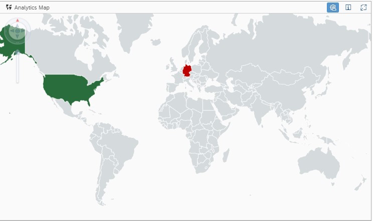
- Analytics Map: Consolidate monitors to a specific region on the world map. The region is colour coded to the aggregated monitoring status of the monitors included. Aggregation uses worst case rule i.e The colour of the region is green only if all the involved monitors are in green.
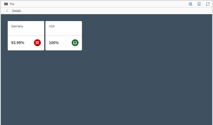
2. Tile View: Shows the consolidated monitoring status of a specific Scenario/System/Managed Object. Aggregation uses worst case rule.
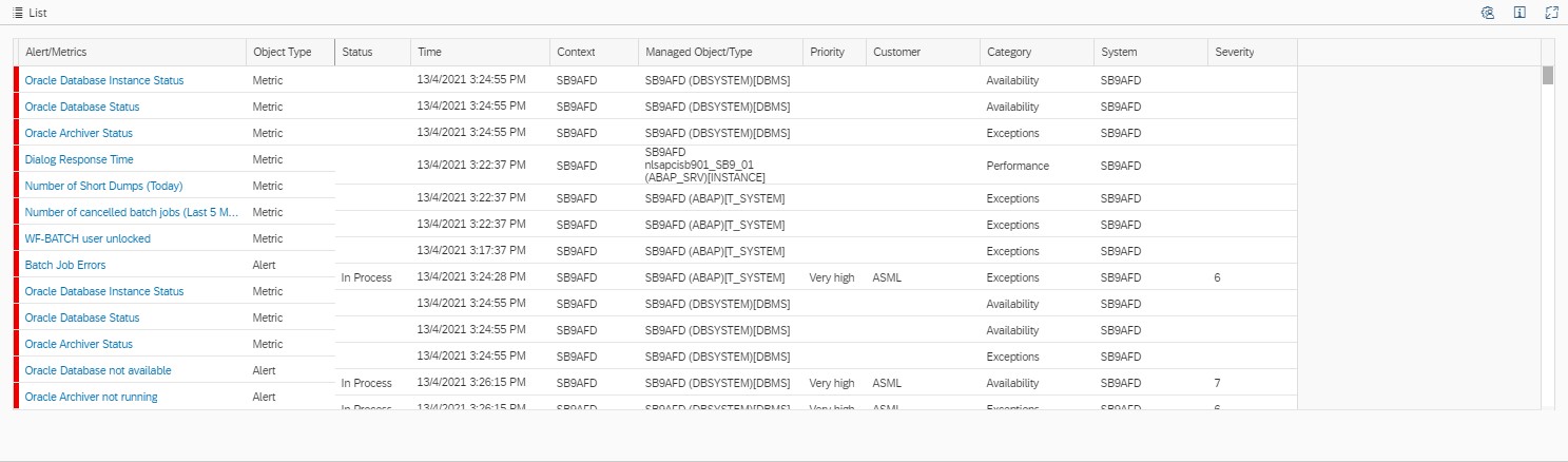
3. List Deatils View: Shows the list of involved monitors.
The above three views are linked automatically to eachother to enable the drill down functionality. That is, if you click on a perticular region which is rated in the world map view, you will get the correspoding systems/componenets for that region in the tiles view and the corresponding monitoring metrics in the list view.
Operation Dashboard Setup
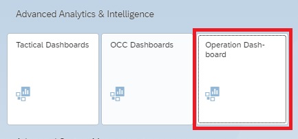
To access Operations Dashboards click on Operations Dasboard tile under Advanced Analytics & Intelligence section in the Focused Run Launchpad.
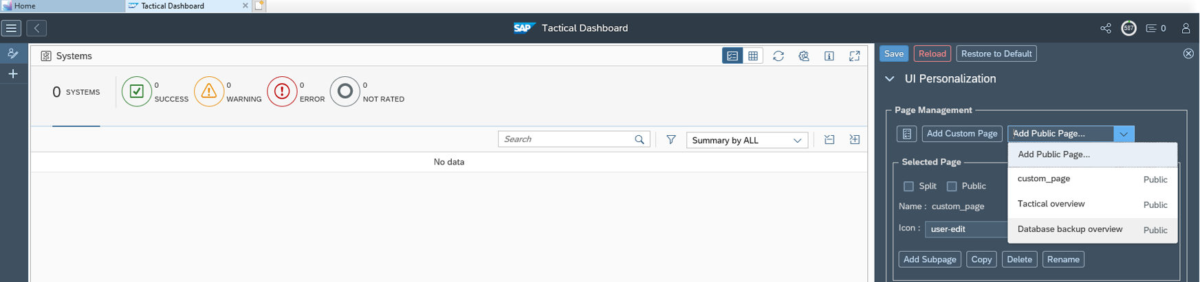
Step 1: Create a new Operation Dashboard
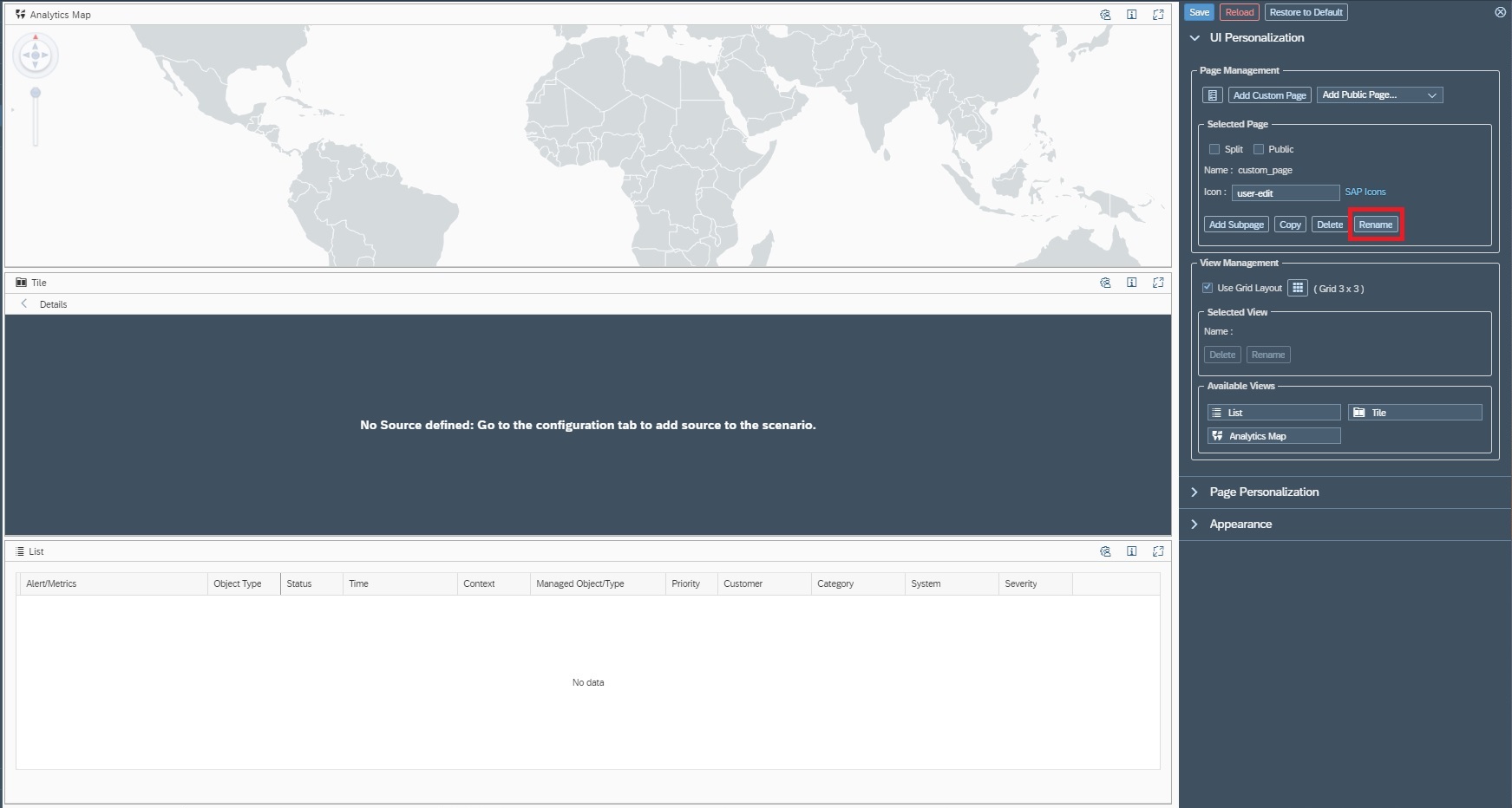
Create a new Operations Dashboard by clicking on Add Custom Page in the navigation pannel of Operations Dashboard app.

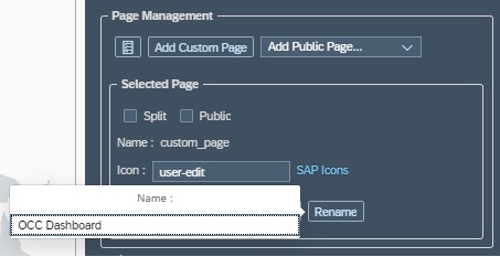
Step 2: Name your dashboard
When you create a new dashboard, the dashboard setup are will appear on the right hand side of your screen. Click on the rename button as shown below.
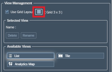
Step3: Configure layout
You can configure the layout of your dashboard in a Grid format. Each grid in the layout will hold a view of your dashboard. As we have 3 types of views you can form a layout of 3 grids. To configure the grid layout click on the Grid button in the setup area – View Management section
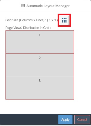
In the pop-up you can drag and drop to form a Grid layout

Step4: Select monitoring content
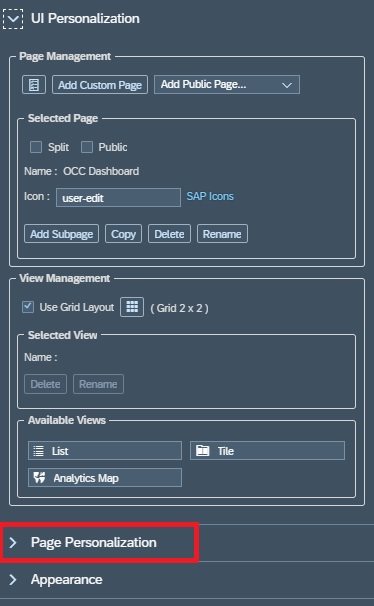
To customize your Operations Dashboard, you first need to select the monitoring content as the source of data from either of System Monitoring or Real User Monitoring or both. For this navigate to Page Personalization area.
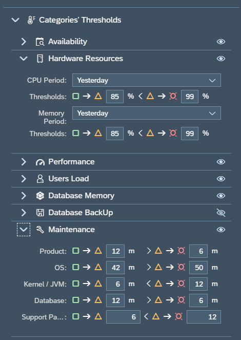
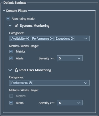
In the Default Settings area you can
- Select or deselect monitoring area (System Monitoring/ Real User Monitoring)
- Select or deselect metric or alerts
- Select or deselect category (Availability/Exception/Performance)
- Alert Severity ( Alerts of same or more severity are included in the scope of the dashboard)
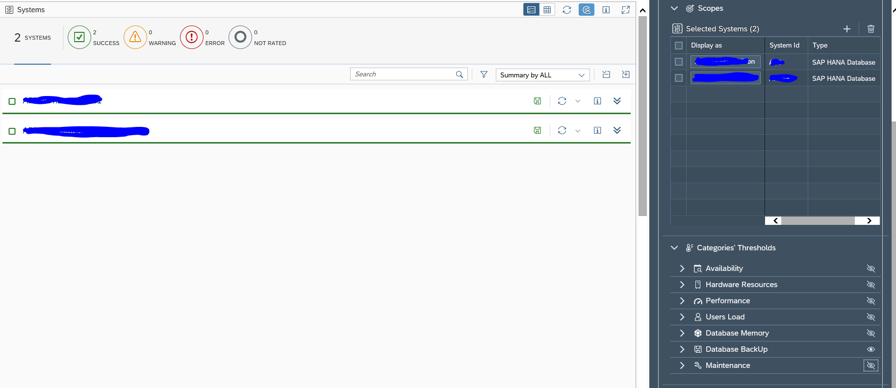
Step 5: Create scenarios
In Order to link systems/ components to a particular region in the world map you need to create scenarios and link them to specific regions in the world map.
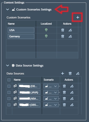
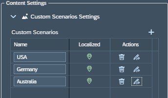
In this step you create named Scenarios or Regions to which you can later on tag your monitors. For this navigate to the Content Settings Area , Custom Scenarios Settings. To create a new scenario click on the + sign.
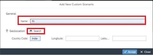
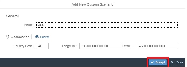
In the pop-up you can directly enter the country name or code or you can click on search to search for your respective country/region and it’s code.

You can see the list of all scenarios you created in the Custom Scenarios section.
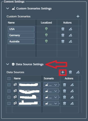
Step 6: Add monitors and tag monitors
In this step you add systems/components and tag them to specific scenarios you created in the previous step.
For this navigate to Content Settings area, Data Source Settings and click on the + sign.
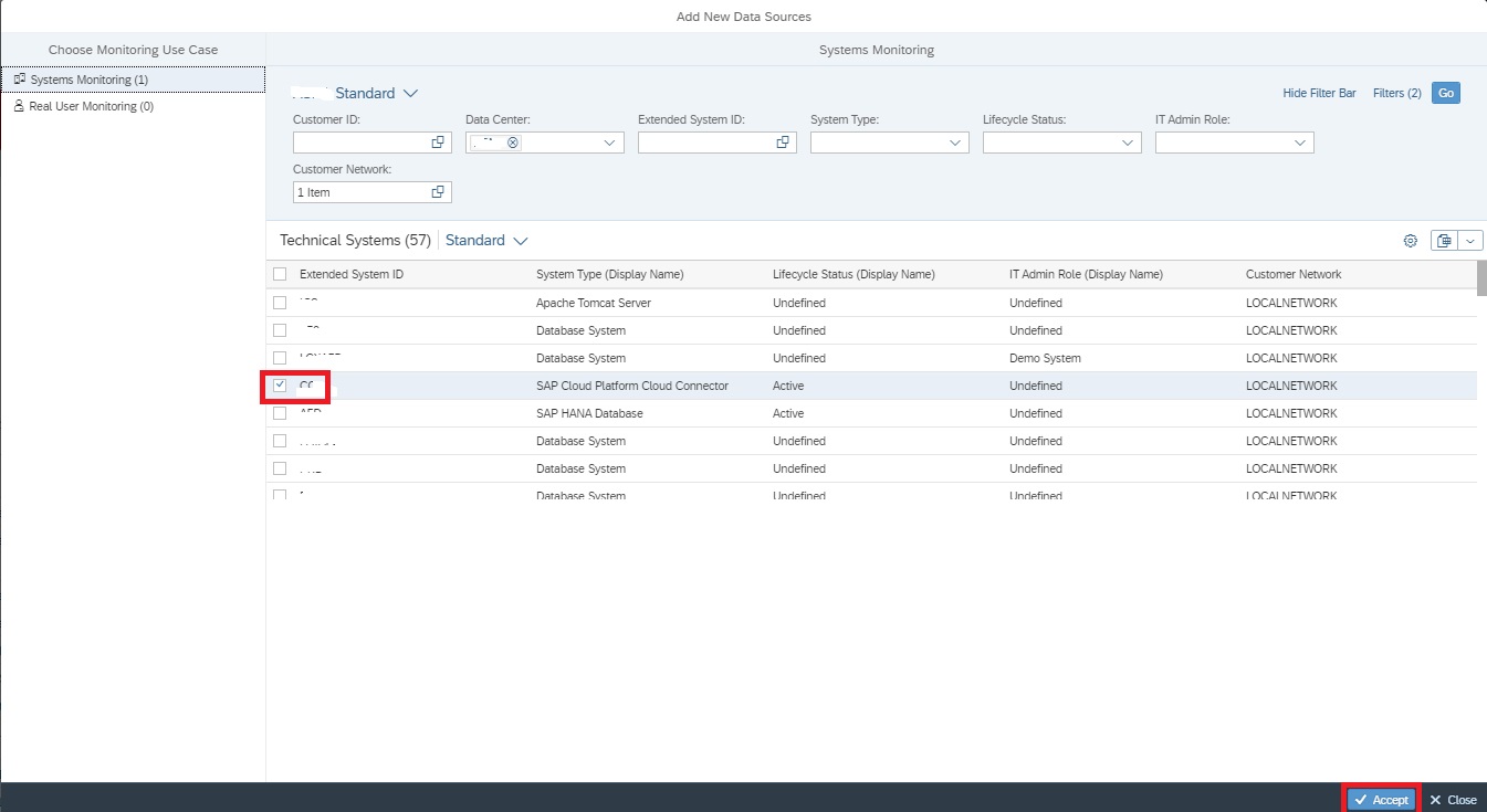
In the pop-up screen select the system/component you want to add and accept to continue.
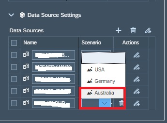
Now back in the Data Sources list select the scenario for the system/component you just added.
Now your Operations Dashboard is ready.
- In View 1: World Map, the regions are coded as per the aggregated rating of all systems/componenets tagged to a specific scenario in the Data Sources settings in Step 6.
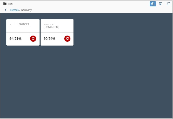
- In View 2: Tiles View, by default shows the Region/scenarios aggregated rating in tiles. In this view you can drill down to aggregated rating for each system/Compoenent/monitor by simply clicking on the tile. (For instance below shows the Tile view of the systems in Germany shown in the image 2 of this blog.
3. In View 3: the List View, shows the monitors for all the system/componenet shown in Tiles view, that is, if you drill down in Tiles View, accordingly filtered monitors are shown in Tiles view.