OCC dashboards are the most flexible form of dashboarding in SAP Focused Run. It is completely up to you to define any dashboard based on the available data.
The explanation below will give a quick introduction on how to setup a dashboard with as example a line graph with CPU for one system and amount of short dumps per hour for that system in a bar chart.
Set up new dashboard
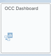
Start the OCC dashboard FIORI tile:
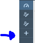
Click the add a new dashboard icon on the left:
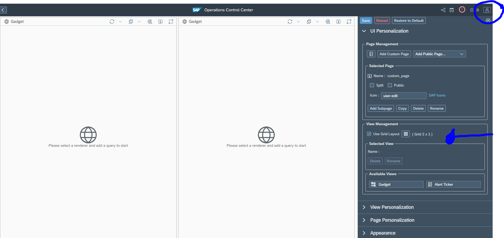
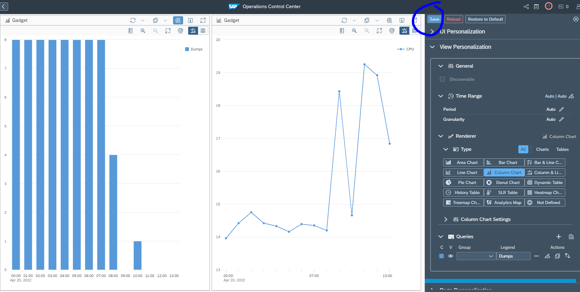
Now open on the right hand side icon the personalization. Here you can change the default 2 by 1 layout if want as well:
Now per gadget, select the personalization. First choose the type of graph, then select the query details:
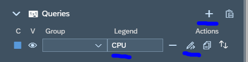
Add the query by clicking the Plus sign:
Give the legend a name and press the Change query button:
First select the data source. In this example we choose system monitoring. Select next your system, and select the metric (in this case CPU). Don’t forget to save on top of the personalization!
We repeat for the other gadget, but now select short dumps per last hour as example:
Test your dashboard to see if the results are according to your expectation.
Make dashboard public
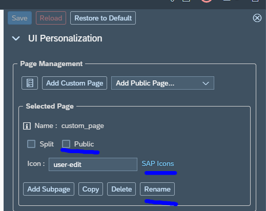
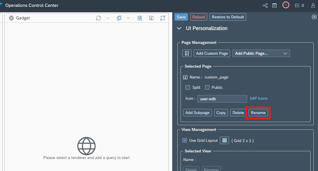
If you are happy with your dashboard, you can make it public. To do so, go to the personalization options:
Set the selected page to public, select a proper icon, and rename the default user-edit to a proper name and don’t forget to Save.
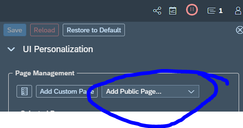
Other users can now add you dashboard from their UI personalization menu by clicking the Add Public Page and add your dashboard:
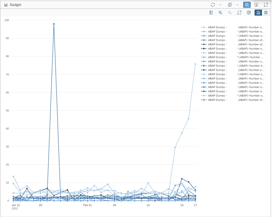
We can use SAP Focused Run OCC Dashboards to build a ABAP Dump Trend Analysis dashboard.
Using OCC Dashboard we can use the data provider for System Monitoring to pull the data of Short Dumps per day metric in to a trend chart.
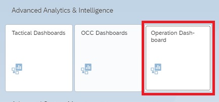
For accessing the OCC Dashboards app click on the OCC Dashboards App in the Advanced Analytics & Intelligence section of the Focused Run launchpad.
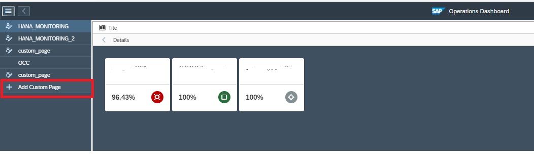
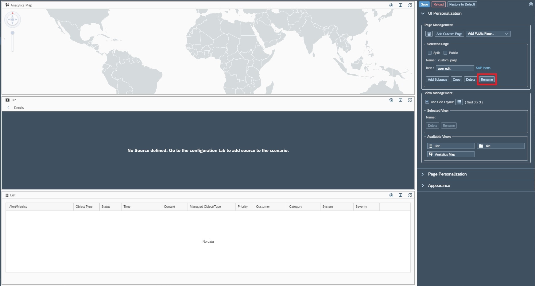
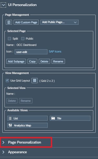
In the OCC Dashboard app you can create a new dashboard page by clicking on Add Custom Page in the navigation panel.
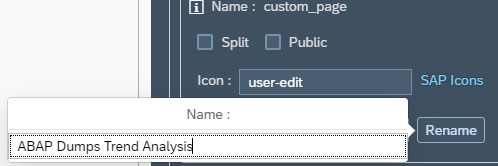
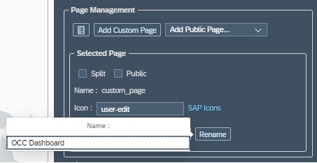
By default your new page will be named as custom_page, you can rename your page by clicking on Rename in the settings section and then providing a new name.
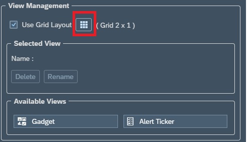
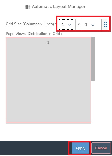
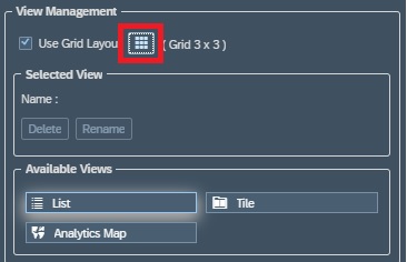
In the View Management section of the settings area you can modify the grid layout. By default you have 2 columns in 1 row. In this example we will change to 1 X 1 to keep just the ABAP Dump Trend Analysis dashboard. (Note: we can add a dashboard to each grid in the layout).
Now for adding the dashboard to the pane we just created, we click on the settings button for that pane.
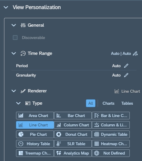
Then in settings area, under View Personalization –> Render we select the graph type. In this case we want to perform a trend chart so we select Line Chart.
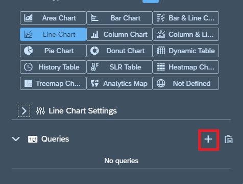
Now we need to create a query for the chart that would provide the data for our graph. For this in the Query section we click on the + sign to add a query.
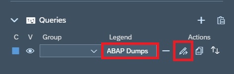
Now in the Query Section, for the newly added row you provide a name under Legend and then click on the change button to start editing the query.
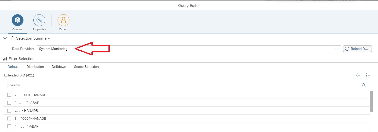
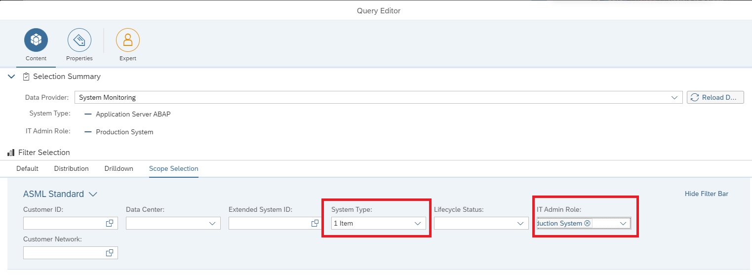
In the Query Editor screen select the data provider System Monitoring.
Now we navigate to the Scope Selection tab to select the managed systems for which the dashboard should display data. In this example we selected System Type as Application Server ABAP and IT Admin role as Production to select all ABAP production systems.
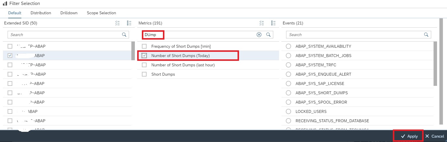
Now in the Default tab , under Extended SID select any ABAP system and then under Metrics tab select the metric Number of Short Dumps (Today). Click on Apply button to activate the selection.
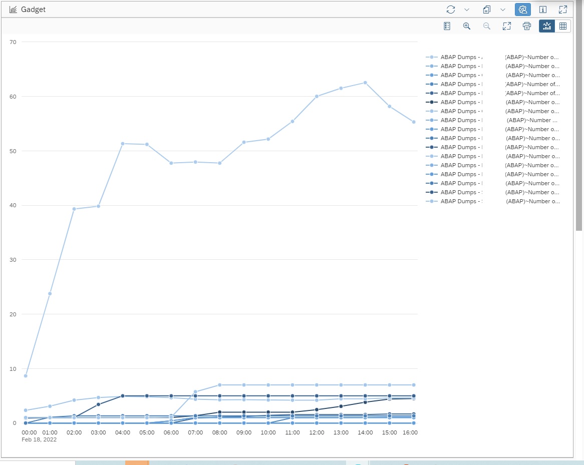
Now you can see the ABAP Dumps trend lines for the selected scope of managed systems in the graph.
Note: By default a graph for System Monitoring data provider will select Auto resolution of data which will show the data for today with hourly frequency.
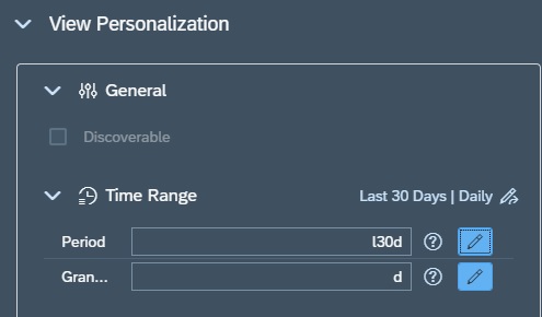
You can change the resolution in the Time Range Section in the Settings area. For example here we set Period for last 30 days as “l30d” and Granularity for every day or daily as “d”.
Note: OCC Dashboard graphs will always average out the data as per the granularity set for the graph w.r.t actual collection frequency of the selected metric. For instance if the metric Number of Short dumps (Today) has a hourly frequency and we show the daily data in the graph, then the value shown in the graph will be average of all hourly data collected by the metric for that day, which will of course be different from the actual final daily count. Hence to ensure data shown on graph is accurate, ensure that the Number of Short Dumps (Today) metric has a daily frequency. Then the granularity of the graph and the metric data collection frequency being exactly same, both will have the exact same and accurate data.
To know more abut OCC Dashboards and all possibilities with it you can refer to SAP Documentation here.
With Focused Run 3.0 a new dashboarding framework available called Operation Dashboard. This enhancement comes under the Advanced Analytics & Intelligence (AAI) functionality of Focused Run.
With Operation Dashboard you can configure a 3 level drilldown dashboard to track the current situation of monitoring and alerting in the areas of System Monitoring and Real User Monitoring.
Currently you can track metrics and alerts only from areas of System Monitoring and Real User Monitoring.
Views in Operations Dashboard
Operation Dashboard provides 3 types of view to provide a consolidated view of the current status of monitoring and alerting.
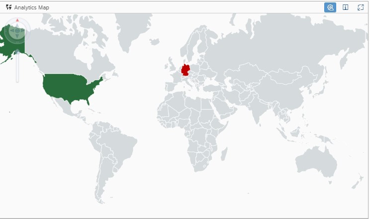
Analytics Map: Consolidate monitors to a specific region on the world map. The region is colour coded to the aggregated monitoring status of the monitors included. Aggregation uses worst case rule i.e The colour of the region is green only if all the involved monitors are in green.
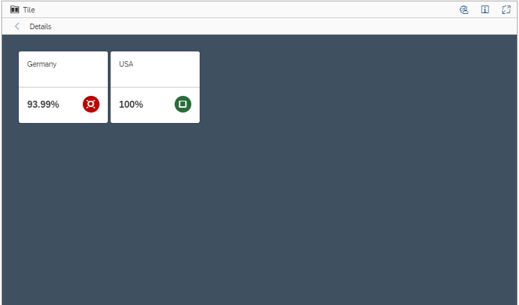
2. Tile View: Shows the consolidated monitoring status of a specific Scenario/System/Managed Object. Aggregation uses worst case rule.
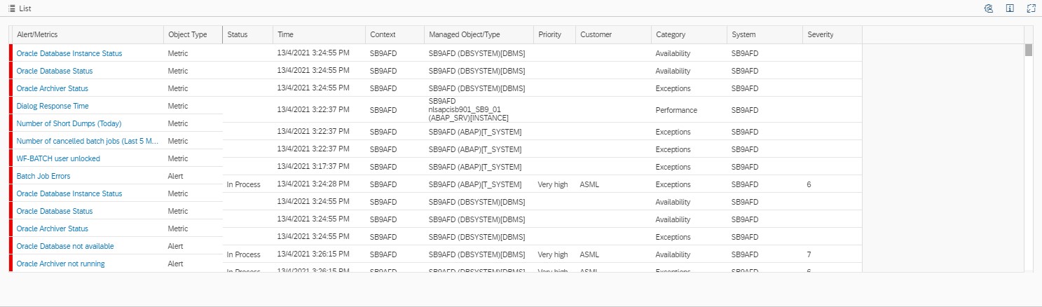
3. List Deatils View: Shows the list of involved monitors.
The above three views are linked automatically to eachother to enable the drill down functionality. That is, if you click on a perticular region which is rated in the world map view, you will get the correspoding systems/componenets for that region in the tiles view and the corresponding monitoring metrics in the list view.
Operation Dashboard Setup
To access Operations Dashboards click on Operations Dasboard tile under Advanced Analytics & Intelligence section in the Focused Run Launchpad.
Step 1: Create a new Operation Dashboard
Create a new Operations Dashboard by clicking on Add Custom Page in the navigation pannel of Operations Dashboard app.
Step 2: Name your dashboard
When you create a new dashboard, the dashboard setup are will appear on the right hand side of your screen. Click on the rename button as shown below.
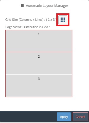
Step3: Configure layout
You can configure the layout of your dashboard in a Grid format. Each grid in the layout will hold a view of your dashboard. As we have 3 types of views you can form a layout of 3 grids. To configure the grid layout click on the Grid button in the setup area – View Management section
In the pop-up you can drag and drop to form a Grid layout
Step4: Select monitoring content
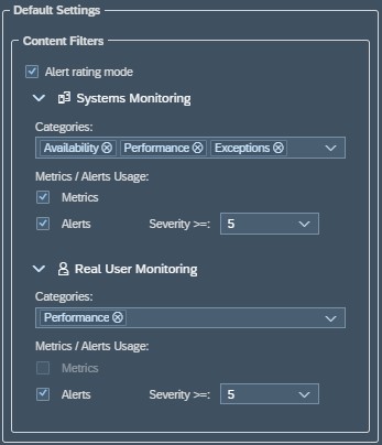
To customize your Operations Dashboard, you first need to select the monitoring content as the source of data from either of System Monitoring or Real User Monitoring or both. For this navigate to Page Personalization area.
In the Default Settings area you can
Select or deselect monitoring area (System Monitoring/ Real User Monitoring)
Select or deselect metric or alerts
Select or deselect category (Availability/Exception/Performance)
Alert Severity ( Alerts of same or more severity are included in the scope of the dashboard)
Step 5: Create scenarios
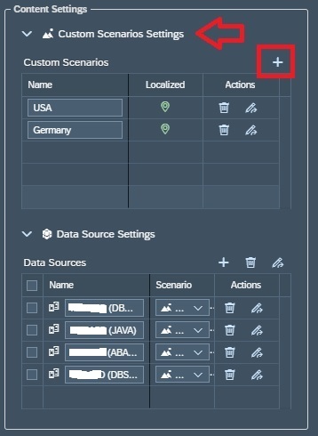
In Order to link systems/ components to a particular region in the world map you need to create scenarios and link them to specific regions in the world map.
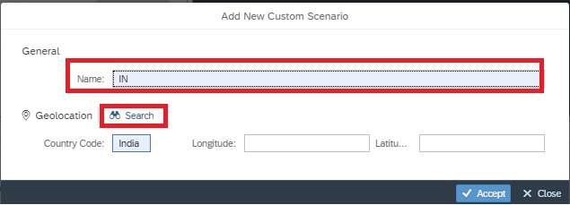
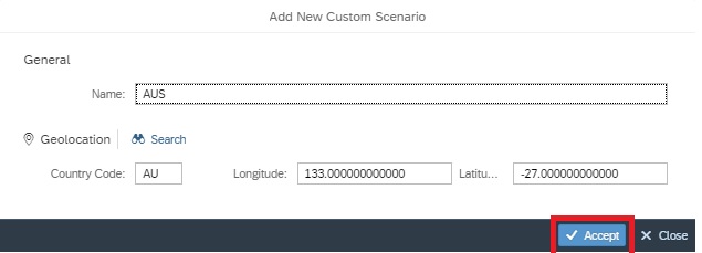
In this step you create named Scenarios or Regions to which you can later on tag your monitors. For this navigate to the Content Settings Area , Custom Scenarios Settings. To create a new scenario click on the + sign.
In the pop-up you can directly enter the country name or code or you can click on search to search for your respective country/region and it’s code.
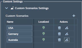
You can see the list of all scenarios you created in the Custom Scenarios section.
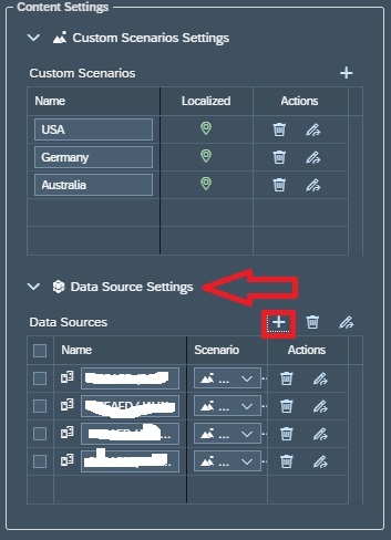
Step 6: Add monitors and tag monitors
In this step you add systems/components and tag them to specific scenarios you created in the previous step.
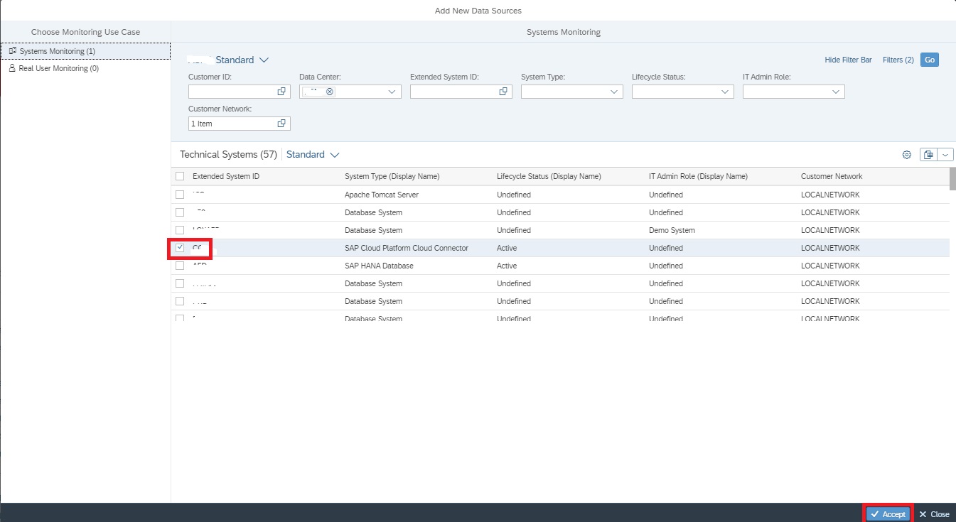
For this navigate to Content Settings area, Data Source Settings and click on the + sign.
In the pop-up screen select the system/component you want to add and accept to continue.
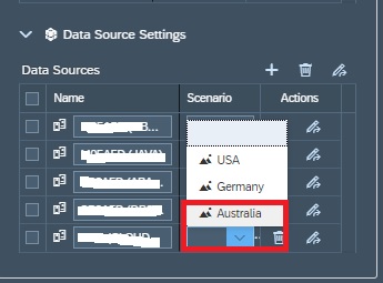
Now back in the Data Sources list select the scenario for the system/component you just added.
Now your Operations Dashboard is ready.
In View 1: World Map, the regions are coded as per the aggregated rating of all systems/componenets tagged to a specific scenario in the Data Sources settings in Step 6.
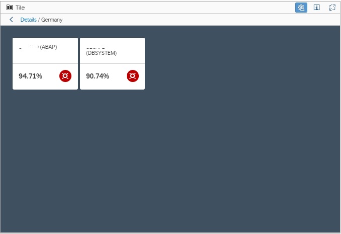
In View 2: Tiles View, by default shows the Region/scenarios aggregated rating in tiles. In this view you can drill down to aggregated rating for each system/Compoenent/monitor by simply clicking on the tile. (For instance below shows the Tile view of the systems in Germany shown in the image 2 of this blog.
3. In View 3: the List View, shows the monitors for all the system/componenet shown in Tiles view, that is, if you drill down in Tiles View, accordingly filtered monitors are shown in Tiles view.
The tactical dashboard is a nice dashboard to check you system status across multiple systems. Items that are part of the tactical dashboard is database backup status, performance, logged on users, software maintenance status.
Questions that will be answered in this blog are:
How to use the Focused Run tactical dashboards?
How to fine tune the tactical dashboards?
How to setup your own tactical dashboard?
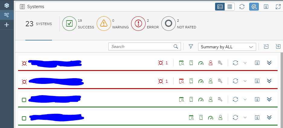
Tactical dashboards usage
To start the tactical dashboard, click the corresponding FIORI tile:
You now reach the tactical dashboard overview screen:
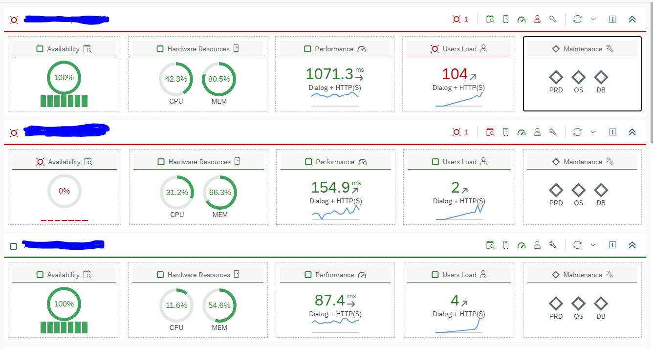
By clicking the Expand Group icon at the right you get first level of details:
By clicking the tile you are interested in you get the details.
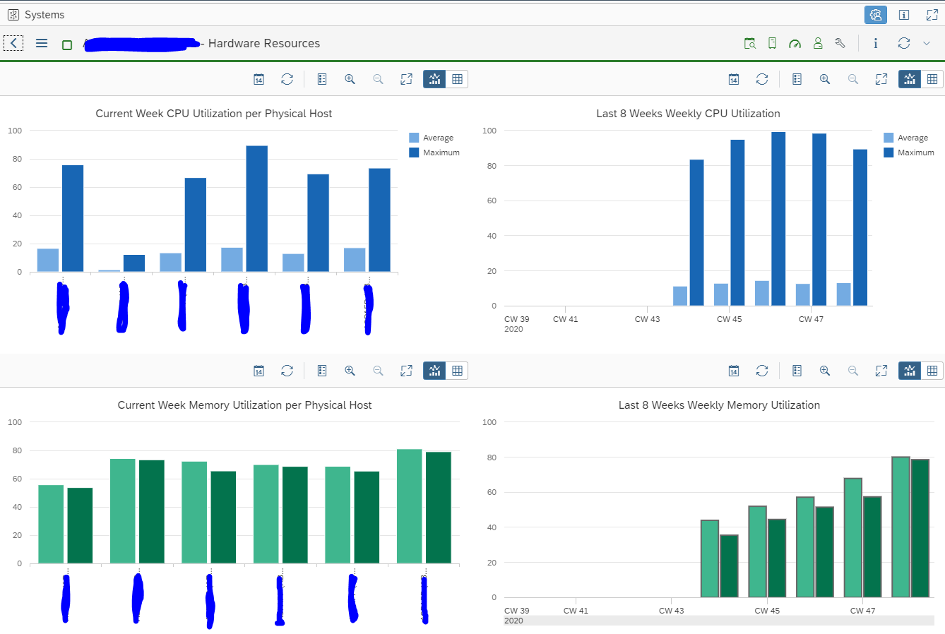
Examples are hardware resources for current week and last month:
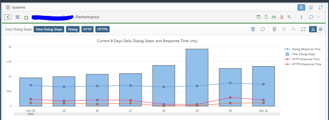
Dialog response times:
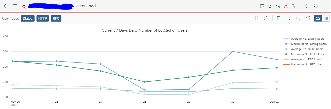
Amount of logged on users:
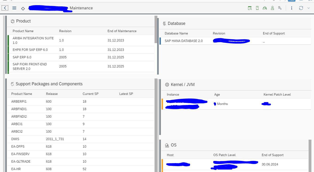
And software maintenance status:
More on the age of software components can be found in this detailed blog.
Configuration of dashboard
By clicking the personalization button top right:
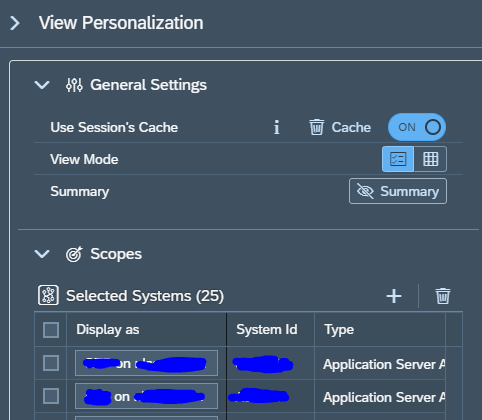
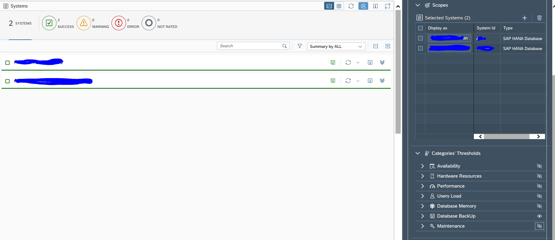
you will reach the configuration screen. Here you can add and delete systems from the overview:
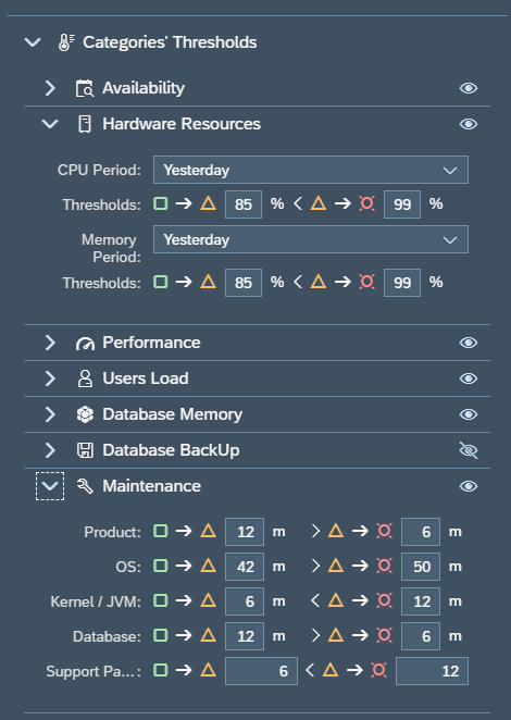
And you can set the view properties and thresholds for each of the categories:
This fine-tuning you do as per your companies needs. By clicking on the Visibility symbol, you can hide an aspect from your overview. Like above the Database backup was put to invisible.
Creating your own tactical dashboard
You can create your own tactical dashboard for your own specific needs. We will take the example here to make a dedicated dashboard for the backups. Since we want to check daily in the overview if the backups were successful.
Start by clicking top left on the big + symbol to add a new dashboard:
The personalization view screen will open:
Important here are a few things. Set the tick box Public if you want to share this dashboard. Find the keyword for the right SAP icon (use the SAP icons link and read this blog). Rename the dashboard by clicking the Rename button.
Now Save the page. Close the personalization. You are now in the empty screen. Open peronalization again to add the system(s):
Also hide the not needed views. On the left hand side you can immediately see the result updating.
Hint: start with one or two systems only when making a new dashboard. First fine tune what you want to see. When all is ok, add the systems later. If you have a lot of systems, the updating of the left hand screen will be slowing you down.
Don’t forget to save off course.
Using a dashboard created by a different user
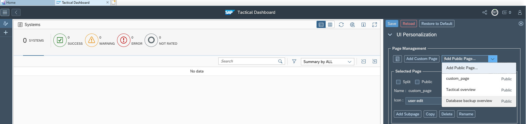
If you want to use a dashboard created by a different user, go to the personalization option and select the add page option:
Now you can select any created dashboard, which has been set to public.
If you don’t see the correct dashboard, check with the owner that he made it public.